The Redifil brand identity is born from our brand concept of Connected Dots and relates to our principles. All our graphic elements and the overall graphic language is a reflection of this.
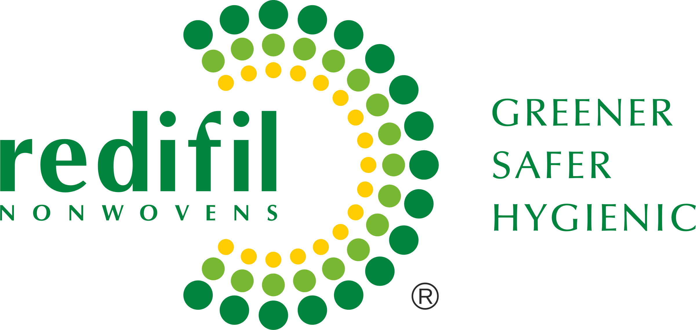
Our tricoloured logo demonstrates our connection with our customers all over the world and refreshes the colours from our brand identity.
The Redifil dots are the expression of our connection with our stakeholders. They come together to reveal specific patterns and insights. From the use of tricolour dots signifying the extent of our connections, to one highlighting a single individual, everything and everyone is connected.
The three circles represent the Redifil’s values, employees, clients and partners. The leaf green of the word identity creates a sense of reliability and authority. The dots represent the diversity and ecological concern of our people, products and services. Its shades remind us of our vision and objectives to support human life on the planet in an encouraging and sincere way.
New Brand Concept
The dots on the new logo represent a Greener, Safer, Hygienic brand and the way it connects with its consumers in terms of technology and expertise, applying insights across industries and delivering quality products. The tri-colour dots convey dynamic energy and optimism. The new identity invites customers to join us in a future that’s better and bolder and even more beautiful.
Keeping in mind the intention of the brand to become part of the solution retaining strengths of the strong brand, from a design perspective for Redifil we have endeavoured to create an effective, simple and impressive logo solution accepting the brand identity change challenge fulfilling its desire for cleaner environment. We have explored various routes to reach the new design of the logo as below.
New Brand Identity
The new logo design is vibrant, striking and very identifiable, yet remains eco-friendly and approachable that captures brand’s aspirations to be a Greener, Safer, Hygienic brand. The leaf green, light green and golden yellow colour dots look like a protection symbol denoting environmental sensitivity and the energy which depict it to be a growth-oriented brand.
The Optima fonts used in leaf green are simple, timeless and easy to understand the brand. They depict and emphasize the commitment of a brand manufacturing quality products. Unique Leaf Green colour used in letters and the dots give an impact that the company takes care of nature and manufactures environment-friendly products as well as makes efforts to protect the environment. The graphical design adds solidity and visual quality to the logo.


Partner With Us
We request you to fill up the below form and submit, we will get in touch with you very shortly.

